CONCEPT2 REDESIGN
THE OPPURTUNITY
Concept2 is the go-to rowing machine used by Olympic athletes,
Cross-Fit competitions, and home users worldwide; yet, their website is severely behind the times with y2k UI and an overload of information at odds with their other online presences. How can I redesign the site to improve pain points, streamline information, and retain their brand values, keeping them competitive in the online markets?
ROLE
Solo Project - UX/UI Designer
TIMELINE
Fall 2023 - 6 Week Project
ASSIGNMENT
Redesign the desktop experience for the Home Page, landing page for one of the products, and Workout of the Day Page. Choose one page to create a responsive mobile display.
*This is not sponsored by Concept 2 and isn’t intended for professional use by myself or Concept2.
This project was close to my heart because I was on crew for all of Highschool and used Concept2 Ergs daily. It gave me a unique position of insight to this project and several surprises because even after using these machines for 4 years, I had no idea about their website!
.01 site audit

On the surface, Concept2 is a leading rowing machine company started in 1976 who sells row ergs, ski ergs, bike ergs, and oars. But what makes it the leading machine in the industry?
loyalty
longevity
community
These strengths give it a firm grasp on the rowing community and world of gyms but as more and more personal rowing machines enter the market, it is at risk of losing its edge. How can I redesign their website to reflect the core values and embrace the new era of Erg machines.
Site Finds
Lets start with the positives
-
An extremely informative site
-
Loyal employees
-
Strong customer support system
on each page
-
Detailed workout tracking
-
Podcast, Blog, Logbook, Apps
-
Workout of the Day

Now for areas that could use Improvement

Navigational Redundancies
Too many layers of navigation bars and drop downs. In addition, there are many redundancies where many titles take you to the same links. How can these be simplified?

Inconsistent Site Branding
The shop page and logbook page takes users to a different site. Once there, the Concept2 header takes you back to the home page of the new site rather than back to the original concept2 home. Branding colors and formatting differ on each page.

Buried Features
With all the extensive information on the page, many features such as the podcast and blog get buried behind the layers of navigation. When I talked to my old rowing team the few that knew about the website did not know about these features. How can Concept2 encourage erg users to access their resources?


Overwhelming Text
Every page has an overwhelming amount of information in text form. It leads viewers to skim information or skip it entirely. How can Concept2 increase visual engagement and portray information in an eye catching way?


Primary site
users
Elite Athlete
-
Buys an erg to keep up with training
-
Part of team or bigger fitness organization
-
Looking to get the most out of their body and machine
-
Competitive in the community
Amateur Athlete
-
Buys an erg to keep/stay in shape
-
Looking to be motivated and improve technique
-
Community aspect is very appealing
primary users who purchase ergs
for others
Gym Manager
-
Erg is just another machine in the sea of gym equipment
-
Wants reliable equipment
-
Responsive customer service
-
Keeping track of orders is important
Coach
-
Wants high quality, reliable ergs
-
May recommend product or site functions to help athletes improve
-
Ingrained in the community
-
May want to shop secondhand
Secondary site
users
Recreational Athlete
-
Only use gym or team equipment
-
Unaware of site benefits
-
Can struggle with motivation outside of team practice
Friends and Family
-
Order products for their erg enthusiast family/friend
-
Is not familiar with the sites or products
Government
-
Purchasing process important to track
-
Quantity is important
-
Clear and Quick Communication
First Time logbook user

Elite athlete purchasing ski erg part

procurement needs customer support


Many rowers on the market have unique selling points that make it ideal for personal rowers. Looking at the other sites gave me a lot of insight of how to modernize the website and push Concept2's strengths in new, eye-catching ways.
.02 comparative/competitive

Competitors
Transaction

Expansion

Information Presentation


Aviron competes with Concept2's at home rowing machine market. Their unique angle is that they are "The Future of Fitness Entertainment"
Where does Aviron Succeed?
-
A way to keep any level of rower motivated
-
Targeting a niche of home users
-
Eye catching visuals
-
Easy to digest information
-
Quick & painless shop experience
What does this tell us?
Fitness entertainment is a growing trend that is creeping in on Concept2’s recreational home users. How can Concept2 keep up with the market among these Fitness Entertainment changes?
Transaction

Expansion

Information Presentation


Wintech competes with Concept2's oar market. Both companies sell racing equipment to Teams and Individuals but Wintech's mission is to "make it easier and more affordable to buy quality shells that improve performance at all levels."
Where does Wintech Succeed?
-
Clean, digestible information with an option to dive deeper if interested
-
Visuals are clear and informative
-
Cohesive branding across site
-
Proof is in the pictures
What does this tell us?
Even though it is hard to navigate Concept2, people trudge through Concept2 because for their team, the results are worth it. How can we make the experience match the results?
Comparators
Transaction

Expansion

Information Presentation


Hudson is a comparator to Concept2 because they do not sell any of the same equipment Concept2 does but they still share an audience of coaches and elite rowers.
Where does Hudson Succeed?
-
Clear, direct audience
-
Encourages strong community offline
-
Proves its worth through achievements
-
Information easy to digest and on the eyes
-
Strong, cohesive branding
What does this tell us?
Hudson offers a streamlined, simple website yet is a brand that the audience wants to be in on and off the water. How can Concept2 emulate the cohesive branding while keeping their wealth of knowledge?
Transaction

Expansion

Information Presentation


Hudson is a comparator to Concept2 because they do not sell any of the same equipment Concept2 does but they still share an audience of coaches and elite rowers.
Where does RowHouse Succeed?
-
Focus is all on getting audience to come in to a location in person
-
Encourages strong community offline
-
Backed by science but does not overload audience with details
-
Information easy to digest and on the eyes
-
Strong, cohesive branding
What does this tell us?
The Concept2 page lacks being able to provide
in-person motivation and tries to makes up for it with a variety of online community games. How
can it encourage more interactions like RowHouse to compete with other products such as Aviron?
![Harvey Balls [Recovered] 1.png](https://static.wixstatic.com/media/1c6ad8_4c9253d02fc34facb31079b09a113bb6~mv2.png/v1/fill/w_735,h_452,al_c,q_85,usm_0.66_1.00_0.01,enc_avif,quality_auto/Harvey%20Balls%20%5BRecovered%5D%201.png)
Referencing the comparative/competitive sites as well as other sites that appealed to the direction I wanted to take Concept2 in, I created a series of wireframes. Below is a selection of some of the final pages.
.03 wireframes


As a team we conducted research about urban transportation and the daily workflows of people. This allowed us to create personas and begin finding pain points within the users journeys.
.04 final product


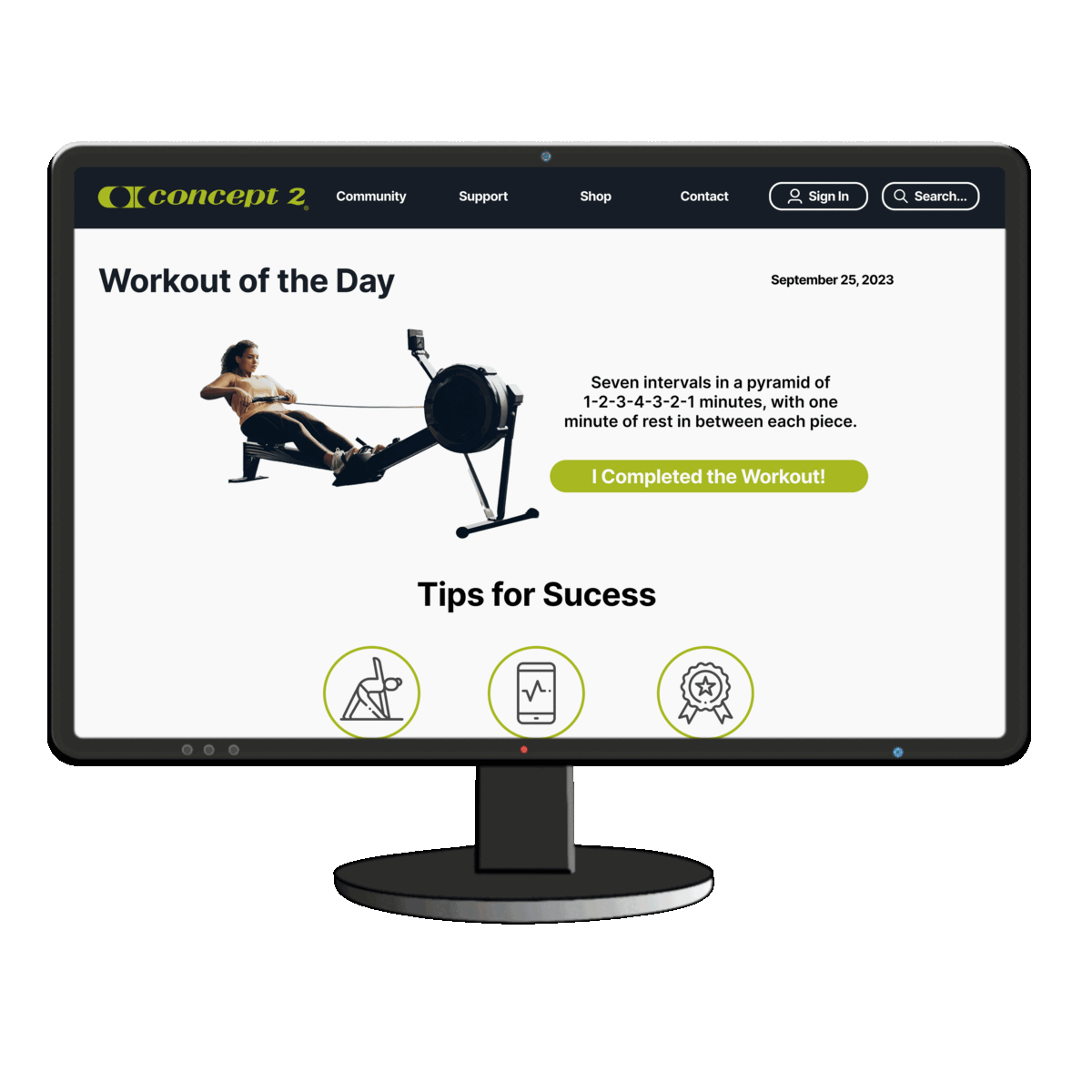
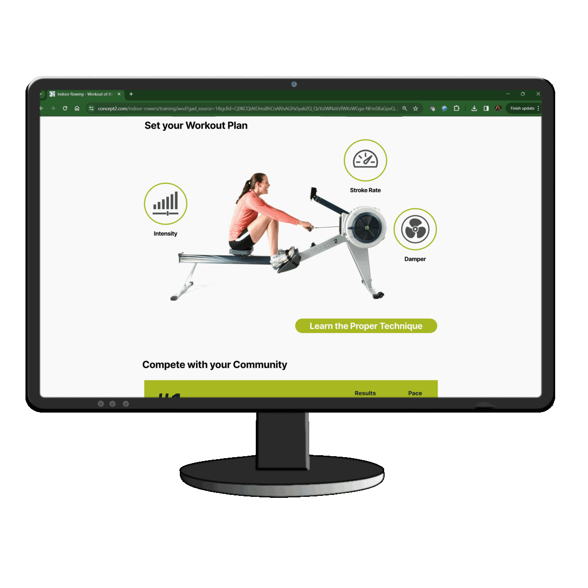
Connect with rowers all over the world! Get motivated by seeing when others complete their workout of the day and join the ranks.
There are many new terms when breaking into the rowing world and it can be daunting to learn. Adding a visuals helps newcomers get familiar and gain better technique.

yOU MAY ALSO LIKE . . .

UI/UX Design
.jpg)